Fraunhofer
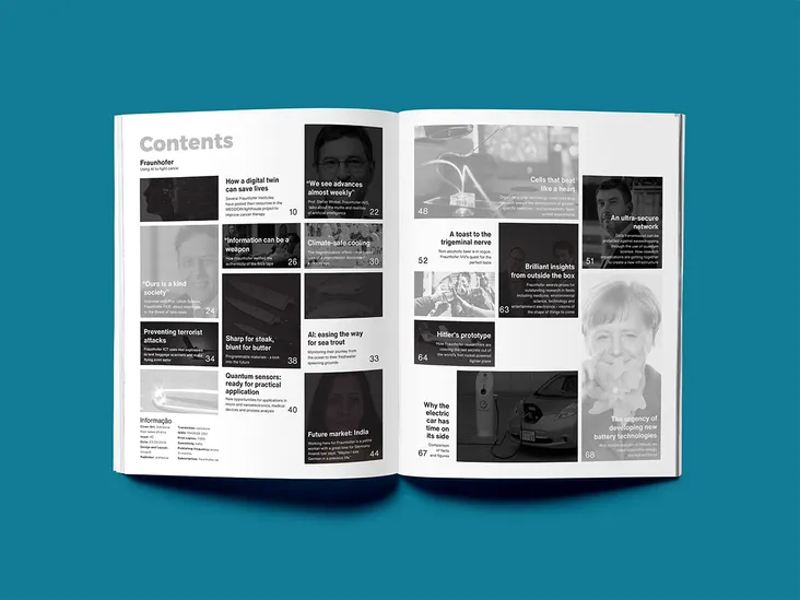
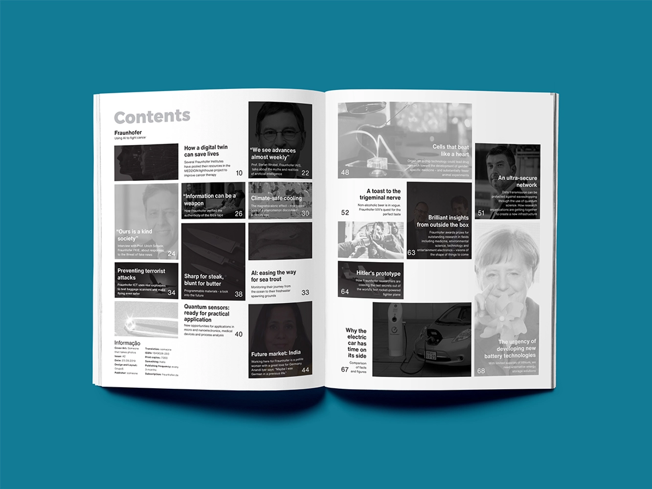
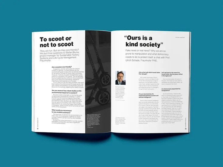
This project aimed to develop a layout for Fraunhofer's scientific journal based on a grid so that it could be easily repeated while remaining dynamic. It was also necessary to take into account the variety of text typologies that the magazine had and the need to contain many images in some topics.
Because of its scientific character, neutral colors and typography were used. Since one of the main goals of the magazine is to promote the work of the company's scientists, their photographs would be in color, contrasting with the neutral tones of the rest of the magazine. Images that need to be in color for full comprehension would also be in color.
This proposal resulted in a summer internship that I attended.